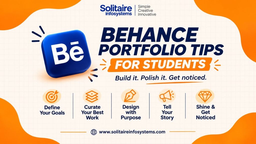
Behance Portfolio Tips for Students: 10 Ways to Stand Out
Request a Quote !

Request a Quote !

Request a Quote !

Blogs

Behance Portfolio Tips for Students: How to Build One That Gets You Shortlisted

  • By: admin
  • date: Nov 19, 2026
Blog Image

The most useful Behance portfolio tips for students come down to three things: upload four to six finished projects rather than everything you have made, show how you got to each final design, and present the work so a recruiter understands it at a glance. Fancy mockups and a long software list matter far less than most students expect.

This guide covers what to upload, how to present it on Behance, the mistakes that show up again and again in student portfolios, and a checklist to run before you share your link.


What is a Behance portfolio, and why does it matter for students?


Behance is Adobe’s free platform for publishing creative work. Each piece is a “project”: a cover image, a title, and the images, text or video inside it. Your profile collects those projects into one portfolio with a single shareable link.

For a student or fresher, that link often does the job a work history would do for an experienced designer. When you apply for a graphic design internship, a reviewer will usually open your portfolio before reading your CV in detail. In a few minutes they are checking:

  • How you think: can you take a brief and solve the actual problem, or are you only decorating?
  • Your basics: typography, spacing, colour and hierarchy.
  • Tool comfort: whether you can produce clean files in Photoshop, Illustrator or Figma.
  • Finishing: whether you take an idea all the way to a polished final.

None of this needs years of experience. It needs a handful of well-chosen projects, presented properly.

10 Behance portfolio tips for students

1. Upload your best 4–6 projects, not all of them

A portfolio is judged by its weakest project. Five strong projects make a better impression than twenty mixed ones, because a reviewer remembers the poster that looked rushed. Pick projects that show range, for example one brand identity, one social media campaign, one poster or packaging piece and one UI screen, and leave the rest offline until they are ready.

2. Design your cover for a small thumbnail

Most people decide whether to open a project from its cover alone. According to Behance’s own cover image guide, covers display at 202×158 px, but you need to upload an image of at least 808×632 px so it stays sharp on high-resolution screens. You can crop to the exact size inside the editor.

At that size, fine detail and long text disappear. Use one clear focal point (the logo on its packaging, the strongest app screen) and strong contrast. You can explain the project inside it, so the cover does not need a paragraph of text.

3. Show the process, not just the final design

Reviewers hire the thinking, not just the output. A simple structure works for almost any project:

  1. Brief: what was the problem, and who was it for?
  2. Research: references, competitor looks, mood boards.
  3. Sketches and drafts: early ideas, including ones you rejected.
  4. Iterations: what changed, and why.
  5. Final outcome: the finished design, shown in use.

A common gap: students upload the final logo and skip the rejected versions. Those rejected versions, with one line on why each was dropped, are often what shows a reviewer you can take feedback and make decisions.

4. Keep the presentation consistent

Your projects can look completely different from each other. The way you present them should not. Use the same image width throughout a project, the same caption style and the same spacing between sections. On the technical side, Behance’s project image suggestions recommend JPEG or PNG files that are 2800 px wide or smaller and under 10 MB. Blurry or heavily compressed images make good work look careless.

5. Use mockups, but don’t hide behind them

A mockup helps people picture the design in real life: a logo on a business card, a social post inside a phone, a website on a laptop screen. Use one or two per project. If every image is a glossy mockup, the reviewer cannot see your actual typography or layout. Always include at least one flat, full-size view of the design itself.

6. Write descriptions that explain your decisions

Three or four short lines per project are enough: the objective, the audience, the tools used and the one decision you are proudest of. Compare these two:

  • Weak: “This is my creative branding project for a café.”
  • Better: “Rebrand for a neighbourhood café that wanted to attract college students. I chose a hand-drawn logotype and a warm two-colour palette so the brand felt informal but stayed readable on cups and menus. Made in Illustrator and Photoshop.”

The second one tells a reviewer how you think in about 40 words.

7. List the tools you actually used

Tag each project with the software behind it. The usual set for graphic design students:

  • Adobe Illustrator: logos, icons and vector illustration.
  • Adobe Photoshop: photo editing, compositing and social creatives.
  • Figma: UI layouts, wireframes and clickable prototypes.
  • Adobe InDesign: brochures, magazines and multi-page layouts.
  • Canva: quick marketing graphics. It is useful, but it shouldn’t be the only tool in your portfolio.

Only list software you can use comfortably. In an interview, “show me how you’d do this in Illustrator” is a common request.

8. Build projects around realistic briefs

Class assignments often have no real audience. A self-written brief fixes that. Some ideas that work well:

  • Rebrand a local café, bakery or salon.
  • Plan a three-post social media campaign for a festive sale.
  • Create a full identity (logo, colours, type, stationery) for an imaginary startup.
  • Redesign the homepage of a website you find hard to use, and explain what you fixed.
  • Design the ordering screens of a food delivery app.

Write the brief at the top of the project. It shows you can work from requirements, which is most of what a design job involves. If you want briefs set and reviewed by working designers, a structured graphic designing course gives you that feedback loop.

9. Complete your profile so recruiters can act on it

Add a clear profile photo, your location, your main skills, and links to LinkedIn or a personal site. When you publish a project, Behance asks for a title and a cover image. Add a relevant creative field and a few honest tags too, so your work shows up in search. Then write a bio that says what you do and what you’re looking for:

“Graphic design student focused on brand identity and social media design. I work mainly in Illustrator, Photoshop and Figma. Open to graphic design internships.”

10. Update it every few months

Your first version won’t be your best, and that’s fine. Every few months, add your newest strong project and remove the weakest one. Re-present an older project if your skills have clearly improved. A portfolio that keeps changing tells a reviewer you are still learning.

What projects should students add to a Behance portfolio?


Choose projects according to the role you are applying for. This table shows what each type demonstrates:

Project type What it shows a reviewer Best for
Logo and brand identity Concept thinking, consistency across uses Graphic design, branding roles
Social media campaign Messaging, working in a series, platform sizes Agency and marketing roles
Poster or editorial layout Typography, composition, hierarchy Print and publishing roles
Packaging design Branding in 3D, practical constraints Branding and product roles
Website or app UI Layout, usability, user flow UI/UX roles


If you are aiming at UI/UX, put two app or web projects first. For a branding or agency internship, lead with identity and campaign work.

What are the most common Behance portfolio mistakes?

  • Uploading unfinished work: one half-done project pulls down the strong ones.
  • Low-resolution images: good design looks careless when it is blurry.
  • Mockups only: the reviewer can’t judge the design itself.
  • No descriptions: without context, a strong concept looks like a random image.
  • Copying popular Behance projects: reviewers see the same trending styles daily. Take inspiration from them, but build your own concept.
  • Too many similar projects: six logo sets show one skill six times.
  • No way to contact you: add an email or a LinkedIn link.

Does a graphic design internship or industrial training help your portfolio?


Yes, mainly because of the feedback. Class projects are usually reviewed once and graded. Practical training or a graphic design internship puts you through real cycles of brief, draft, feedback and revision, with deadlines. That is exactly the process tip 3 asks you to show, and it gives you finished, reviewed work to upload.

Solitaire Infosystems, a software development and IT training company in Mohali, offers project-based graphic designing  and UI/UX design training as part of its industrial training for students and freshers. Options include 4-week, 6-week and 6-month industrial training, and stipend-based internships.

Whichever institute you consider, ask these questions before you join:

  1. Will I work on realistic briefs, or only follow tutorials?
  2. Who reviews my work, and how often?
  3. How many finished portfolio projects will I have at the end?
  4. Which tools will I use on real tasks, not just in demos?

Final checklist before you publish your Behance portfolio

  • 4–6 finished projects, each showing a different skill
  • Covers uploaded at 808×632 px or larger, with one clear focal point
  • Process shown in every project: brief, drafts, final
  • At least one flat, non-mockup view of each design
  • A 3–4 line description and tool tags on every project
  • Bio says what you do and what you are looking for
  • Contact details or LinkedIn link added
  • Spelling checked in titles, descriptions and the design itself


Frequently asked questions

How do I make a Behance portfolio with no experience?

Create 4–6 self-initiated projects from realistic briefs, such as a café rebrand, a social media campaign or an app screen. Show the brief, your drafts and the final design in each one. Reviewers look at how you solve problems, not whether a client paid for the work.

How many projects should a student upload on Behance?

Start with 4–6 finished projects that each show a different skill. Add more only when a new project is stronger than your weakest current one.

What size should a Behance cover image be?

Behance displays covers at 202×158 px and asks for an upload of at least 808×632 px, so the image stays sharp on high-resolution screens. Use JPEG or PNG, and keep a single clear focal point.

Is Behance or Dribbble better for design students?

Behance suits full case studies that show your process across a whole project. Dribbble is built around shorter visual “shots”. Many students use Behance as their main portfolio and Dribbble for quick work-in-progress posts.

Does industrial training help build a graphic design portfolio?

It can, if the training includes realistic briefs and regular feedback. That combination produces finished, reviewed projects that show your process, which is what a portfolio needs.


Want feedback while you build your portfolio?


A strong portfolio comes from finishing projects and having someone point out what isn’t working yet. If you’d like to build yours with guided briefs and reviews, explore the Graphic Designing training at Solitaire Infosystems or talk to our team about the next batch.


About the Author

Comments